Design and Web team summary – 4th August 2020
Anthony Dillon
on 4 August 2020
Tags: Design
The web team here at Canonical run two week iterations. Here are some of the highlights of our completed work from this iteration.
Meet the team
Hi everyone!

I’m the Canadian 🇨🇦 on the Web Team here at Canonical. I joined Canonical as a software engineer around 8 years ago and since then have worn a few hats.
I started writing code sometime around 1993 with Qbasic, dabbled in some C, C++, before ultimately ending up working with the various components of the web stack and working with PHP, Perl, Python, Go, Javascript. Day to day I’m working with Juju, JAAS and building the Juju Dashboard.
Outside of a computer, I enjoy being outside and snow, wake and kiteboarding.
Web squad
Our Web Squad develops and maintains most of Canonical’s promotional sites like ubuntu.com, canonical.com and more.
Promotions
This iteration we created two new takeovers.
Building powerful customer solutions

This is a small series of webinars to explain how GSIs can work with Canonical’s offerings. If you are interested, please join us.
Comparing Red Hat OpenStack Platform and Canonical’s Charmed OpenStack

Learn how you can improve your total costs by moving to Charmed OpenStack overusing RedHat.
Japanese website updates

We have been updating a few parts of the localised Japanese ubuntu.com website. This iteration we added a new newsletter with our popular CLI cheat sheet for server users as an incentive for joining.
Portuguese version of the VMware to Charmed OpenStack whitepaper

This is the first Whitepaper that we have translated into Portuguese. If you are interested in potentially moving from VMware to OpenStack, please grab it.
Get the VMware to Charmed OpenStack whitepaper >
Automotive page
The automotive page has been revamped with all new content and illustrations. The page also includes a unique animation.
The animation was developed using CSS animations applied to an inline SVG. A combination of transitions and keyframe animations provides the Ubuntu boxes turning on and data flow resulting in the car slightly sliding in. All of which is triggered by Javascript applying a class to the strip when it’s scrolled into view

Notice about the latest Chromium update
The desktop team plans to provide some information about the latest Chromium update in Ubuntu 20.04.1 from within the operating system. Which the web team provided a stand-alone HTML page. The main consideration was to remove external dependencies which involved inlining the CSS and inline SVGs. As size was a concern we stripped back the CSS provided by Vanilla to the bare minimum. Giving us good insights into the critical CSS provided by Vanilla.
Brand
The Brand team develops our design strategy and creates the look and feel for the company across many touch-points, from web, documents, exhibitions, logos and video.
Ubuntu infographics
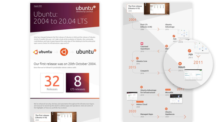
We worked with the Marketing Team on an infographic to promote Ubuntu 2004 to 20.04 LTS, it required a number of new graphics to be created.


Pictogram development
The pictogram design exploration from the last iteration progressed into some initial design concepts. We aim to present the full presentation internally and take them to the next stage.


Vanilla
The Vanilla squad designs and maintains the design system and Vanilla framework library. They ensure a consistent style throughout web assets.
Chips
We’ve been working on upstreaming some of the search and filter component work from our React components library. This work involves the styling for the chip component. Which was recently released as part of Vanilla v2.15.

Application layout
We continue the work on application layout. After the initial phase of prototyping, we are implementing the application grid layout and the panels styling into Vanilla framework.


We’re also finalising the application panels UX spec.
Vanilla Suru strips
Canonical websites often use distinctive slanted Suru backgrounds. They’ve been initially implemented for ubuntu.com and copied to other sites. We are in the process of moving the most common of these patterns into Vanilla, so they can be consistently reused across our sites and applications.


MAAS
The MAAS squad develops the UI for the MAAS project.
KVM List page in React
Our KVM page is halfway through the ReactJS transition. We just completed our QA both in Design and UI in our KVM listing page. Aside from that our graphs are more simplified and should work in responsive views. The KVM details page is on its way to QA and should be completed soon!

New CLI
On the UX side of our iteration, we continue the quest to understand problems with the existing CLI in MAAS. We are also hopeful that we can create a more aligning structure for the CLI across products.
In this iteration, MAAS UX and Snapcraft UX had sync and immerse ourselves in the CLI experience to align the underlying problems in our CLIs across products and created an initial guideline for the CLI input structure and output structure. We are still working on it and gathering feedback from the team to figure out different states of our outputs, such as empty state, incomplete state, tone of voice, and more states to find out.
Our goal is to make MAAS CLI simpler and more human-readable.
SR-IOV and NUMA aware VMs
NUMA aware VMs have been our focus for quite some time. We want our users to be able to deploy high-performance workloads on KVM hosts. This includes aligning the VMs to a single NUMA node, as well as using SR-IOV to improve networking throughput and latency.
In this iteration, we have gone through a few UX design stages to simplify and visualise the connection between NUMA nodes and machines, as well as providing a way to incorporate hugepage memory into the virtual memory for better performance.
We have explored a few versions of design options as below:

The first design focuses on the ability to show different sections of the virtual memory when they are split into general purposes and hugepages.

Our second design focuses on scalability and the ability to add more hugepage memory of different page sizes in the future. Our third design focuses on responsiveness of our UI by breaking down the virtual memory into a doughnut chart and combining information in a card form.

Finally, we establish the connection between NUMA node and machines within the summary view:

In our future work, aside from being able to add multiple hugepage memory into the virtual memory, we also want to make the connection between virtual functions and network interfaces more succinct.
JAAS
The JAAS squad develops the UI for the JAAS store and Juju dashboard projects.
Cross-model relations – UX workshop
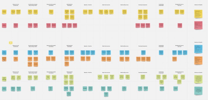
During the last iteration we spoke to some Juju users about their experience of Cross-model relations (CMR), we have summarised all the insights into a report. In this iteration, we started to analyse the key requirements around displaying CMR information on the JAAS dashboard in a workshop.
Adding additional controllers to the dashboard
UX design-wise, we adopted the new Vanilla Panel pattern and designed the interaction flow for the feature of registering/editing/removing controllers.

This new feature is now ready for use in the Juju Dashboard 0.2.0 release. Try it out.
Snapcraft and Charmhub
The Snapcraft team works closely with the Store team to develop and maintain the Snap Store site and the upcoming Charmhub site.
Snapcraft
A/B tests on the homepage
In the last weeks, the homepage was running an A/B test to test the search bar on the top level of the homepage. It was a success. The snapcraft.io team will design and update the page to get a fresh look.
Charm Hub
We updated the look and feel of charm/bundle cards on the home page and store page. We also added beautifully topic cards to the store page.
As part of the “publisher” section of the website, we implemented “publisher account details” and “charm settings” pages.
The team is also researching and exploring solutions for the developer experience of Charm Hub, including publishing, consuming and the development journey. We did some user interviews to better understand charm developers’ journeys and try to figure out how the website can support developers throughout their process. This research also helped us better comprehend the differences between the reactive framework and the new approach defined by the operator framework.

In line with this work, we also did a benchmark of different programming language websites, to see how they support their developers in their learning and discovery processes. This is useful to see how others are structuring their content, which could provide some common threads for us to follow.
Talk to us today
Interested in running Ubuntu in your organisation?
Newsletter signup
Related posts
Showcasing open design in action: Loughborough University design students explore open source projects
Last year, we collaborated with two design student teams from Loughborough University in the UK. These students were challenged to work on open source project...
Design and Documentation clinics at FOSDEM Fringe 2026
FOSDEM is one of the biggest and most exciting open source events of the year, held at the Solbosch campus of the Université Libre de Bruxelles (Brussels),...
Open design: the opportunity design students didn’t know they were missing
What if you could work on real-world projects, shape cutting-edge technology, collaborate with developers across the world, make a meaningful impact with your...
