
Draggy Fists
Canonical
on 12 January 2010
Tags: Design
It always feels dangerous to mess with the mouse pointer when working with Flash as it has a tendency to vanish entirely if you you miss a mouse eve due to the mouse button being released outside the Flash window.
This has resulted in my fake version of Ubuntu feeling more solid than the real thing in a way that I haven't put my finger on it until just now.
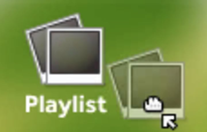
I just added the grabby-hand drag cursor when an icon is being dragged and it feels awful. I thought it might convey useful information but it just makes things feel cheap.
It's the same thing when dragging windows. I don't like it!
It's great to have the cursor show that a copy-action will be performed, or something will be deleted - there is a lot of scope for showing useful information in the mouse cursor. But we need to tone down the noise or it will drown.
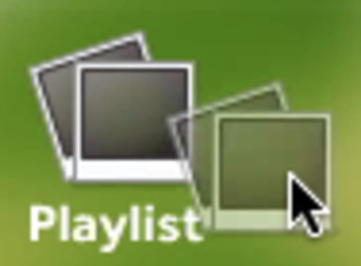
So let's just have a normal pointer during drag operations. Can we, can we please?

This has resulted in my fake version of Ubuntu feeling more solid than the real thing in a way that I haven't put my finger on it until just now.
I just added the grabby-hand drag cursor when an icon is being dragged and it feels awful. I thought it might convey useful information but it just makes things feel cheap.
 |  |
| No thanks! | Yes please. |
It's the same thing when dragging windows. I don't like it!
It's great to have the cursor show that a copy-action will be performed, or something will be deleted - there is a lot of scope for showing useful information in the mouse cursor. But we need to tone down the noise or it will drown.
So let's just have a normal pointer during drag operations. Can we, can we please?


Talk to us today
Interested in running Ubuntu in your organisation?
Newsletter signup
Related posts
From inspiration to impact: design students from Regent’s University London explore open design for their dissertation projects
Last year, we had the opportunity to speak at Regent’s UX Conference (Regent’s University London’s conference to showcase UX work by staff, students, and...
Showcasing open design in action: Loughborough University design students explore open source projects
Last year, we collaborated with two design student teams from Loughborough University in the UK. These students were challenged to work on open source project...
Design and Documentation clinics at FOSDEM Fringe 2026
FOSDEM is one of the biggest and most exciting open source events of the year, held at the Solbosch campus of the Université Libre de Bruxelles (Brussels),...