Mobile Asia Expo 2014
Tom Macfarlane
on 4 July 2014
Tags: Design
Following the success of our new stand design at MWC earlier this
year, we applied the same design principles to the Ubuntu stand at
last month’s Mobile Asia Expo in Shanghai.

With increased floor space, compared to last year, and a new stand
location that was approachable from three key directions, we were
faced with a few new design challenges:
- How to effectively incorporate existing 7m wide banners into
the new 8m wide stand? - How to make the stand open and approachable from three sides
with optimum use of floor space and maintaining the maximum
amount storage space possible? - How to maintain our strong brand presence after any necessary
structural changes?
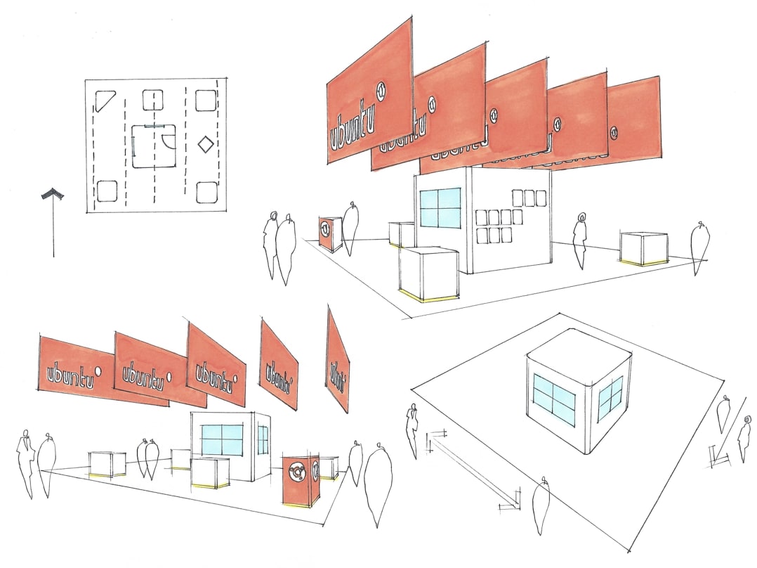
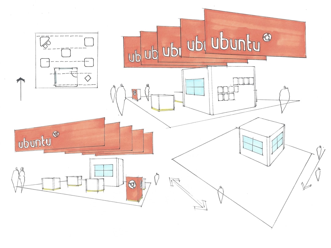
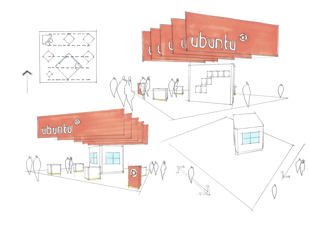
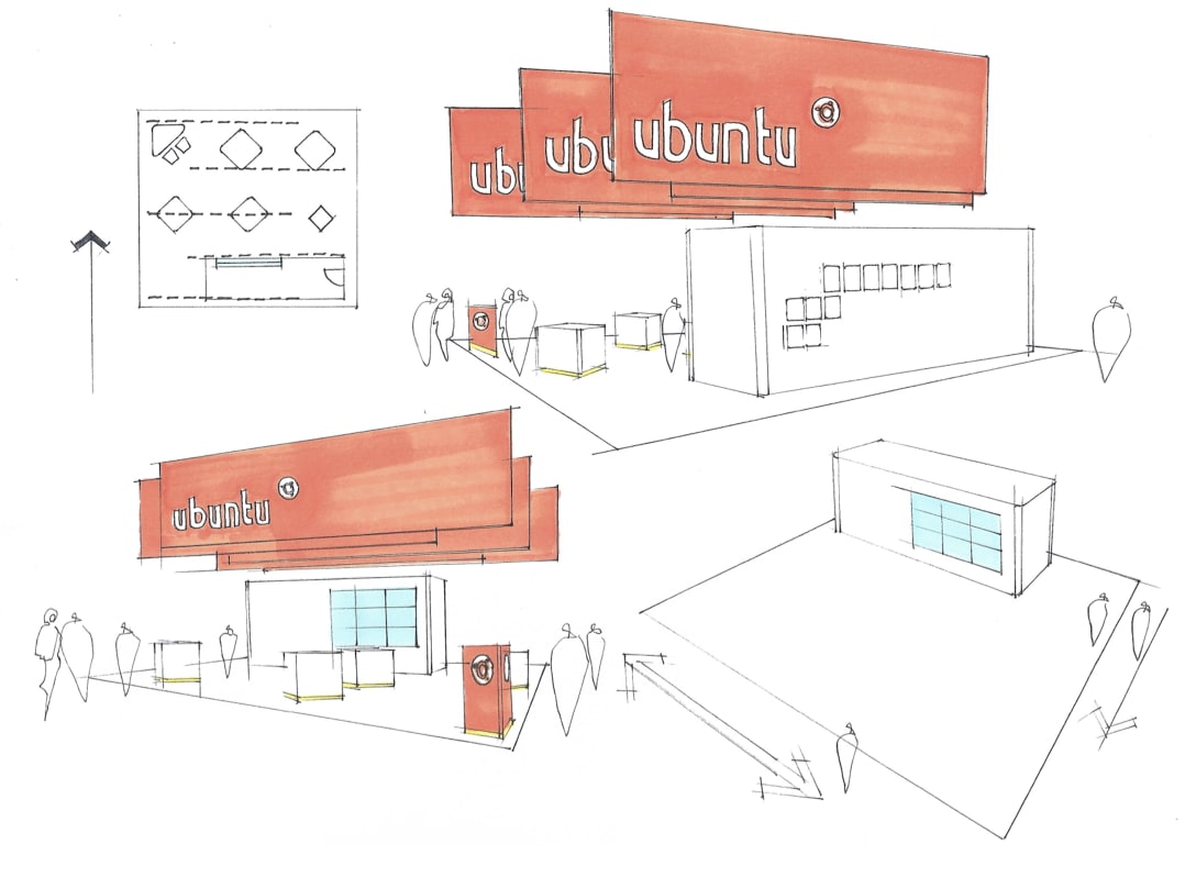
Proposed layout ideas
 Final layout
The final design utilised maximum floor space and incorporated the
positioning of our bespoke demo pods, that proved successful at MWC.
Along with strong branding featuring our folded paper background
with large graphics showcasing app and scope designs and a new aisle
banner. The main stand banners were then positioned in an alternating
arrangement aligned to the left and to the right above the stand.
Aisle banner
Talk to us today
Interested in running Ubuntu in your organisation?
Newsletter signup
Related posts
From inspiration to impact: design students from Regent’s University London explore open design for their dissertation projects
Last year, we had the opportunity to speak at Regent’s UX Conference (Regent’s University London’s conference to showcase UX work by staff, students, and...
Showcasing open design in action: Loughborough University design students explore open source projects
Last year, we collaborated with two design student teams from Loughborough University in the UK. These students were challenged to work on open source project...
Design and Documentation clinics at FOSDEM Fringe 2026
FOSDEM is one of the biggest and most exciting open source events of the year, held at the Solbosch campus of the Université Libre de Bruxelles (Brussels),...


