New year, new website: the new canonical.com
Inayaili de León Persson
on 9 January 2014
Tags: Design
We’ve been talking about it for a while and we are now happy to reveal Canonical’s brand new website.
The brief
We thought that it was more than appropriate that, in the year that Canonical commemorates its 10th anniversary, our website got some love, so that’s exactly what we set out to do.
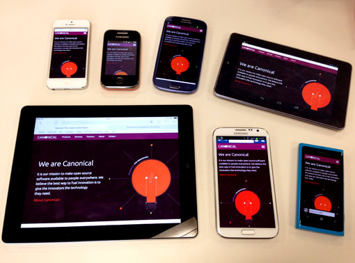
 The homepage of the new canonical.com on various devices
The main goal of this redesign was to create a website that clearly communicates what Canonical is and does. To present our services, describe our role in the creation of Ubuntu and to give users an understanding of the principles behind Canonical as a company.
The journey
We set out to distill the Canonical site into its most essential components. This required a huge amount of editing as the site had grown over time. This was not a straightforward task, but there were a few things that we knew would get us very close to that goal:
- Clearly define canonical.com’s audiences and make sure the new site’s content was created with them in mind
- Move the content that dates easily (events, news, etc.) from the site to a searchable repository
- Move all detailed product and service information to www.ubuntu.com to make it more easy to find
We started preparing to move a lot of the content that previously lived on the site a few months ago when we started the Ubuntu Resources project — a place for content such as news, events, press releases, white papers and case studies.
Ubuntu Resources (currently in ‘alpha’) is also our first responsive site, and a lot of the lessons we have been learning from it, code- and design-wise, have been applied to the new canonical.com, like the small screen site navigation and the global Ubuntu sites navigation.
Carla has published a very interesting post on how she used stakeholder interviews to define the website’s key journeys and audiences. This research was instrumental in keeping the content of the site focused and the information architecture as simple as possible.
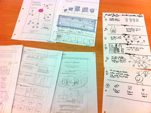
Before moving onto a digital format, we did a lot of collaborative sketching, churning out ideas on how we could illustrate each page’s message.
 Generating ideas: some of our sketches
Even though we were working towards a fairly tight deadline, we went through several content, design and code iterations, with copywriters, designers and developers working closely together and improving as much as possible until we were happy with the results.
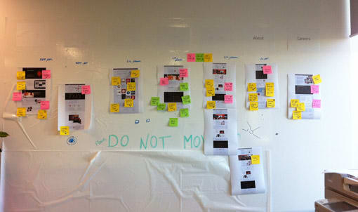
 Our ever-changing analog status board — sometimes only sticky notes will do!
The visual design borrowed most of the underlying patterns from www.ubuntu.com, such as the grid and font sizes. Ubuntu’s website has been evolving into a more ‘open’ design and the new Canonical website takes that idea even further by removing the main content container and increasing spacing between elements.
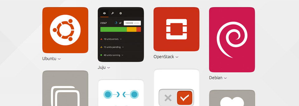
We also brought in new patterns, influenced by the design work that is being done on the phone and tablet, like the grid used in small screens, the Ubuntu shape (the squircle) and the folded paper background.
 Using the squircle and the folded paper background on the new canonical.com
The result
We’re very happy with the result, and we think it achieves the goals we set out to accomplish. Now that the site is launched though, it’s up to everyone who visits it to let us know how we did: do let us know your thoughts in the comments!
Talk to us today
Interested in running Ubuntu in your organisation?
Newsletter signup
Related posts
From inspiration to impact: design students from Regent’s University London explore open design for their dissertation projects
Last year, we had the opportunity to speak at Regent’s UX Conference (Regent’s University London’s conference to showcase UX work by staff, students, and...
Showcasing open design in action: Loughborough University design students explore open source projects
Last year, we collaborated with two design student teams from Loughborough University in the UK. These students were challenged to work on open source project...
Design and Documentation clinics at FOSDEM Fringe 2026
FOSDEM is one of the biggest and most exciting open source events of the year, held at the Solbosch campus of the Université Libre de Bruxelles (Brussels),...
